How do I choose the right size artwork for my wall?
Selecting the right size artwork for your wall is essential to achieving balance, proportion, and visual impact in your home decor. A piece that is too small may look lost on a large wall, while something too large can overwhelm the space. Here’s a guide to help you find the perfect fit:
1. Measure Your Wall Space
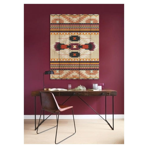
Before choosing artwork, measure the width and height of your wall to determine the ideal size. A good rule of thumb is to select artwork that covers two-thirds to three-quarters of the available wall space for a well-balanced look.
2. Consider the Placement Area
The ideal artwork size varies depending on where you plan to hang it:
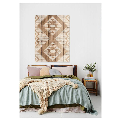
Above a Sofa or Bed: The artwork should be about two-thirds the width of the furniture to create a balanced composition. Example: If your sofa is 180 cm wide, your artwork should be 120–140 cm wide.
On a Blank Wall: If there is no furniture underneath, choose a piece that fills 60-75% of the wall space for a proportional look.
Above a Mantel or Console Table: Keep the width of the artwork within ⅔ of the mantel or table width to maintain a visually pleasing scale.
3. Standard Artwork Size Guide
Here are general size recommendations based on wall space: 1.2 - 1.5m wall: 60 - 90 cm; 1.8 - 2.4m wall:90 - 150 cm; 3m+ wall:150 - 200 cm or multiple pieces
4. Choosing Between a Single Piece or a Gallery Wall
Single Large Artwork: Best for creating a strong focal point in a room.
Gallery Wall: If you prefer multiple pieces, arrange smaller artworks together. Use a consistent frame style or colour scheme to maintain cohesion. Leave 5-10 cm of spacing between pieces for a polished look.
5. Hanging Height Matters
Artwork should be positioned at eye level, with the centre of the piece about 145–150 cm from the floor. If placing above furniture, leave at least 15–25 cm of space between the top of the furniture and the bottom of the artwork.
How should I arrange a gallery wall?
A gallery wall is a stylish way to showcase artwork, photographs, and decor pieces while adding personality to your space. However, arranging it requires planning and balance to create a cohesive look. Follow these steps to design a visually appealing gallery wall:
1. Choose a Theme or Style
Before you start, decide on the overall look you want to achieve:
- Symmetrical: A grid-like arrangement with evenly spaced frames for a clean, modern look.
- Eclectic: A mix of different frame sizes and artwork styles for a relaxed, artistic feel.
- Minimalist: A few large, statement pieces arranged with clean spacing.
- Monochrome or Colour-coordinated: Keep the frames and artwork in a specific colour scheme to create harmony.
2. Select and Collect Your Artwork
Gather pieces that fit your chosen style. You can mix:
- Framed artwork
- Photographs
- Mirrors or decorative objects
- Canvas prints
- Typography or quote art
- If using multiple pieces, try to maintain a common color palette, frame style, or theme to keep it cohesive.
3. Determine Your Wall Space and Layout
Measure the available wall space and decide how large the gallery wall will be. A good rule of thumb is to leave at least 15–30 cm of space around the gallery area so it doesn’t feel cramped.
4. Plan the Arrangement on the Floor
Before hammering nails into the wall, lay out the frames on the floor to experiment with different layouts.
Start with the largest piece in the centre or off-centre as a focal point.
Build around it using smaller frames, balancing the arrangement so it feels even but not too rigid.
Keep consistent spacing between frames, typically 5-10 cm.
5. Create a Template for Accuracy
For precise placement, use paper templates:
Cut pieces of paper to match the size of your frames.
Tape them on the wall with painter’s tape to visualize the arrangement.
Adjust the positioning until you’re happy with the look.
6. Hang Your Frames
Once satisfied with the layout, start hanging your pieces:
Use a level to ensure straight lines.
Hang larger pieces first, then add smaller ones around them.
If using nails, measure and mark the exact spot where the hooks should go.
For a renter-friendly option, use removable adhesive hooks or strips.
7. Final Touches and Adjustments
Step back and assess the final look. Adjust frames if needed to maintain balance. Add accent lighting like spotlights or picture lights to highlight the gallery wall.
What are common mistakes to avoid when selecting wall art?
Choosing the right wall art can transform a space, adding character, colour, and personality to your home. However, selecting the wrong pieces can lead to an unbalanced or cluttered look. Here are the most common mistakes to avoid when picking wall art for your space:
1. Choosing the Wrong Size
One of the biggest mistakes is selecting art that is too small or too large for the space.
Too small: Artwork that is significantly smaller than the furniture beneath it can look out of place.
Too large: Oversized pieces can overwhelm the room and feel disproportionate.
Tip: A general rule is that artwork should take up about two-thirds to three-quarters of the width of the furniture below it.
2. Ignoring Proportion and Placement
Hanging art too high or too low can throw off the balance of the room. The centre of the artwork should be at eye level (around 145–150 cm from the floor). When hanging above furniture, leave 15–25 cm between the furniture and the bottom of the artwork.
3. Not Considering the Room’s Colour Scheme
Selecting artwork that clashes with the existing colours in your room can make the space feel disconnected.
Tip: Choose wall art that complements the primary and accent colours in your space. If your room is neutral, bold artwork can create a statement.
4. Choosing Mass-Produced Art Without Personal Meaning. While generic artwork from large retailers may seem like a quick solution, it lacks personality and uniqueness.
Instead, invest in meaningful pieces, such as:
- Art from local artists
- Personal photographs
- Unique prints that reflect your style
5. Overcrowding or Under-filling a Wall
Too many small pieces can make a wall look cluttered and chaotic. Too few pieces or empty walls can make a space feel unfinished.
Solution: Consider a gallery wall arrangement if you have multiple small pieces or opt for one large statement piece for a more polished look.
6. Using Mismatched Frames and Inconsistent Styles
Mixing different frames can add contrast, but too many inconsistent styles and colours can feel disorganised.
Stick to a cohesive theme - either uniform frames or a well-planned mix of complementing styles.
7. Neglecting Lighting
Poor lighting can make beautiful artwork go unnoticed.
Consider spotlights, picture lights, or natural lighting to highlight your wall art and enhance its visual impact.
8. Not Considering the Room’s Function and Mood
Each space in your home has a different purpose, and wall art should reflect that.
Living room: Bold, statement pieces or a well-curated gallery wall. Bedroom: Soothing colours and calm, relaxing imagery. Kitchen: Playful, food-themed, or minimalist artwork.

